Basic bar plots
For this section, we will be using the weeds dataset where we performed a two-factor ANOVA
For a quick reminder:
weeds.aov2 <- aov(flowers ~ species * soil, data = weeds)
anova(weeds.aov2)
## Analysis of Variance Table
##
## Response: flowers
## Df Sum Sq Mean Sq F value Pr(>F)
## species 2 2368.6 1184.31 9.1016 0.0005203 ***
## soil 1 238.5 238.52 1.8331 0.1830080
## species:soil 2 155.0 77.52 0.5958 0.5557366
## Residuals 42 5465.1 130.12
## ---
## Signif. codes: 0 '***' 0.001 '**' 0.01 '*' 0.05 '.' 0.1 ' ' 1From this, only Species was significant. For this dataset with a continuous Y and categorical X we would plot a bargraph.
There are three main ways to display a bar/column graph, geom_col(), geom_bar() and stat_summary(). I will cover each of them in some depth, showing the benefits to each. Here is a quick breakdown to begin.
| Plot | Pro | Con |
|---|---|---|
geom_col() |
Simple and effective, defaults to displaying data as is | Errorbars are finicky |
geom_bar() |
Errorbars work well, displays sample size/counts by default | Requires a single argument to match geom_col |
stat_summary() |
Quick calculation of mean, used across all geometric types | Difficult to code and errorbars just flat out dont work |
I find best way to generate the bargraph properly, is to use the summarise() command to generate our means and standard errors before plotting. This extra step saves alot of hassle and you can copy this code across any dataset, changing the column names. We can generate these within ggplot, but it leads to complications (see stat_summary() below).
weeds.summarise <- weeds %>% group_by(species) %>%
  summarise(mean = mean(flowers), se=sd(flowers)/sqrt(n()))
This is a quick way to generate our mean and se for flowers for each species. Now, we can graph our results in a bargraph.
ggplot(weeds.summarise, aes(x=species, y=mean, fill=species)) +
  geom_col()
This will generate a pretty basic graph. You will notice that I used fill instead of colour. If you use colour on a column/bar graph it will colour the outline. Using fill will fill the entire bar according to the species.
We used geom_col() to generate a column graph. You can use geom_bar() but it requires a stat = argument. If you use geom_bar(), stat = “identity” use the numbers in the mean column of our data, displaying data as it is in the data frame, rather than counting the number of cases in each X position (its default state).
I personally use geom_bar() as I find it easier to do errorbars later. Future pages use geom_bar()
ggplot(weeds.summarise, aes(x=species, y=mean, fill=species)) +
  geom_bar(stat="identity")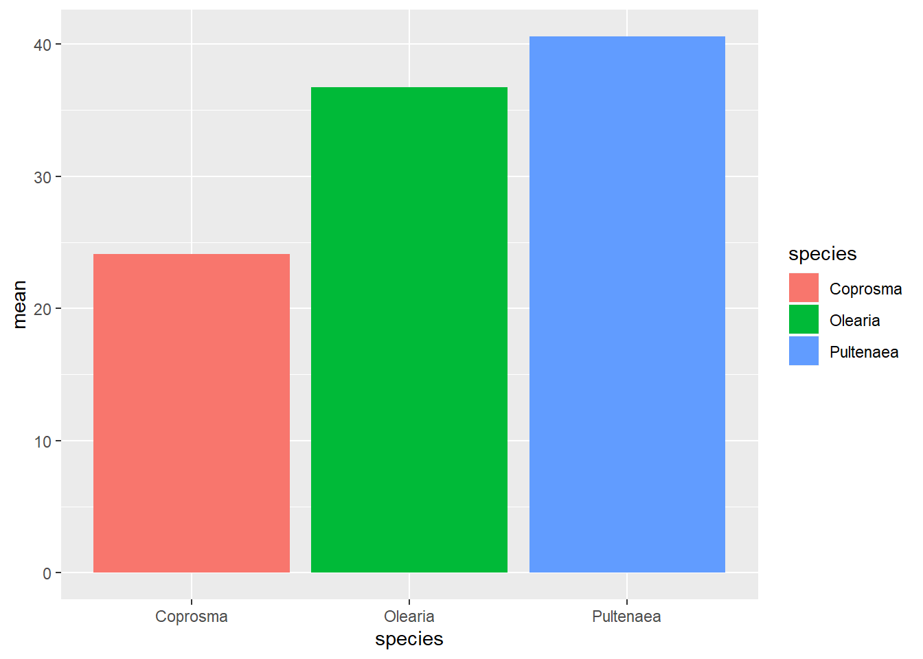
Regardless of what way you graph this, they look the same. For now, let’s work with geom_bar(). Let’s fix up the graph as much as we want, until we are happy.
weeds.bar <- ggplot(weeds.summarise, aes(x=species, y=mean, fill=species))+
  geom_bar(stat="identity", show.legend=F, colour="black")+
  labs(x="Weed Species", y= expression(Flowers~(m^3)))+
  theme(panel.background = element_blank(), panel.grid = element_blank(), axis.line = element_line(colour = "black", size=1), axis.text = element_text(colour="lightsteelblue4", size=12), axis.title = element_text(colour="steelblue", size=14, face="bold"))+
  scale_fill_manual(values = c("lightblue", "steelblue", "darkslateblue"))
weeds.bar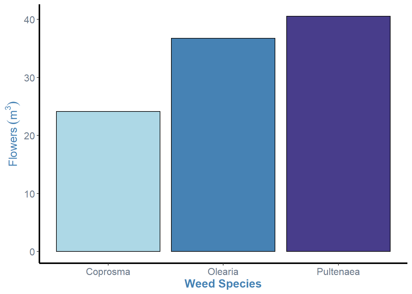
So, now we have our graph in a “nicer” format, we can see that there are some cruical points of information missing from this graph. Most notably, the errorbars and letters or some other notation that denotes statistical differences between the levels (i.e. Tukeys HSD results).
To remove the legend like I have, include the show.legend argument in your geom_bar() command and set it to false. e.g. geom_bar(stat=“identity”, show.legend=F)