Significant notation
When presenting our results to an audience (paper or presentation) it is important to communicate our results clearly in a manner that is understandable to a wider audience. Tha main way to do so with an Analysis of Variance, is using a post-hoc test like a Tukeys Honest Significant Difference (Tukeys HSD). This will analyse the differences between the levels within a factor to distinguish which levels are significantly different from one another.
To jog our memory from our test, let’s run the Tukeys test from our analysis module using the HSD.test() from the agricolae package.
library(agricolae)
HSD.test(weeds.aov2, "species", console=TRUE)
##
## Study: weeds.aov2 ~ "species"
##
## HSD Test for flowers
##
## Mean Square Error: 130.122
##
## species, means
##
## flowers std r Min Max
## Coprosma 24.1250 11.13478 16 13 52
## Olearia 36.7500 12.08580 16 16 55
## Pultenaea 40.5625 10.97858 16 20 57
##
## Alpha: 0.05 ; DF Error: 42
## Critical Value of Studentized Range: 3.435823
##
## Minimun Significant Difference: 9.798198
##
## Treatments with the same letter are not significantly different.
##
## flowers groups
## Pultenaea 40.5625 a
## Olearia 36.7500 a
## Coprosma 24.1250 bAccording to the tukeys results, Coprosma is significantly different from the others. So we will label it A and the others B.
There are two main ways to plot notation on a graph, a manual way using coordinates, and an automatic way. We will cover the manual way first so we can see how it works before preceeding to the easy method.
ggplot(weeds.summarise, aes(x=species, y=mean)) +
  geom_bar(stat="identity")+
  geom_errorbar(aes(ymin = mean-se, ymax = mean+se), width = 0.5)+
  geom_text(label = c("A", "B", "B"), aes(y = c(28.5, 41, 44.5), x = species), size = 6)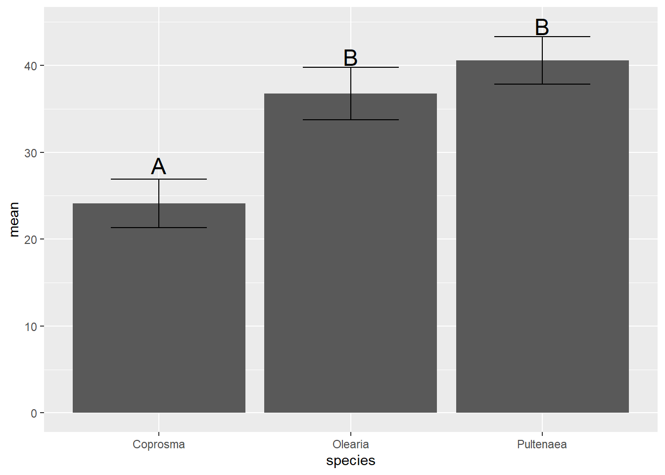
# try including the geom_text() in your original weeds.bar code. Adding notation is done through geom_text(). We need to specify the labels (in order from left -> right) along with the aesthetic coordinates on the x and y axis. The X axis we can direct it to our original x axis data (species) and it will sit in the centre of the column. The Y coordinates are the location on the Y axis the text should sit.
This method is very finicky but is a great method if you are looking to plot one letter/symbol on the graph. You can add multiple geom_text() commands if needed.
The quicker solution to this, is to use a combination of our errorbars and an additional argument called vjust (vertical adjustment).
ggplot(weeds.summarise, aes(x=species, y=mean)) +
  geom_bar(stat="identity")+
  geom_errorbar(aes(ymin = mean-se, ymax = mean+se), width = 0.5)+
  geom_text(label = c("A", "B", "B"), aes(y = mean+se, x = species),vjust = -0.5, size = 6)+
  ylim(0, 50)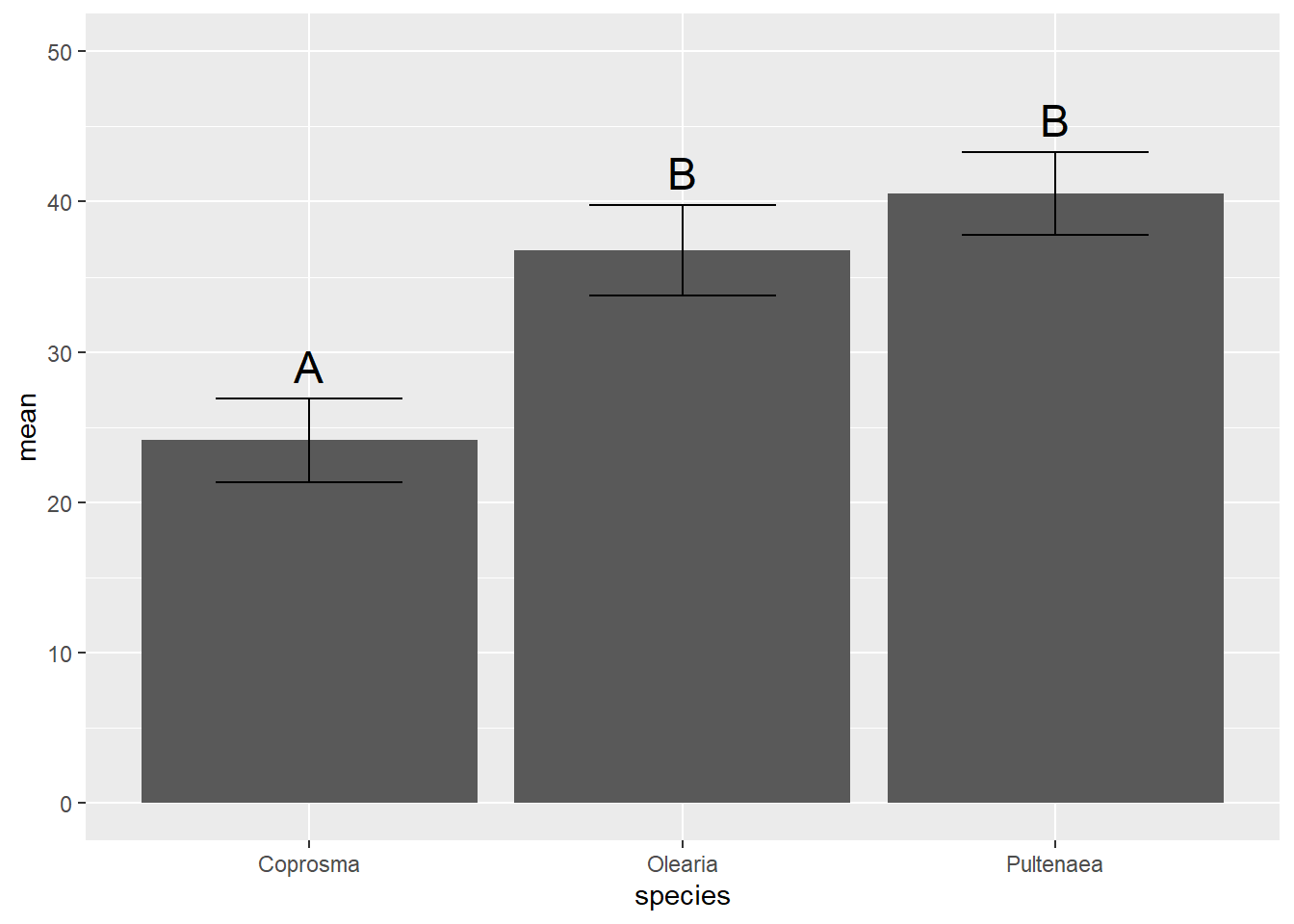
We simply specify our Y coordinates as the top of our error bar (mean + se) and use the vjust (vertical ajustment) argument to move it slightly above the bar. You might have to change your ylim to display the last letter, which got cut off.