Scatter plots
For this section, we will be using the tadpoles.csv data set
The second dataset we analysed tadpole abundance in different sized ponds using a linear model/regression. Plotting linear regressions is really straightforward, but can be done a couple of different ways, depending on what you wish to accomplish.
First, let’s run the basic analysis again (excluding the reeds factor).
tadpoles.lm <- lm(abundance ~ pondsize, data = tadpoles)
summary(tadpoles.lm)
##
## Call:
## lm(formula = abundance ~ pondsize, data = tadpoles)
##
## Residuals:
## Min 1Q Median 3Q Max
## -73.546 -29.752 -8.026 37.978 77.652
##
## Coefficients:
## Estimate Std. Error t value Pr(>|t|)
## (Intercept) 23.8251 25.8455 0.922 0.36662
## pondsize 1.7261 0.5182 3.331 0.00303 **
## ---
## Signif. codes: 0 '***' 0.001 '**' 0.01 '*' 0.05 '.' 0.1 ' ' 1
##
## Residual standard error: 49.42 on 22 degrees of freedom
## Multiple R-squared: 0.3352, Adjusted R-squared: 0.305
## F-statistic: 11.09 on 1 and 22 DF, p-value: 0.003032For this, we will be setting up a scatter plot (geom_point) of our points and then adding the line separately.
ggplot(tadpoles, aes(x=pondsize, y=abundance)) +
  geom_point()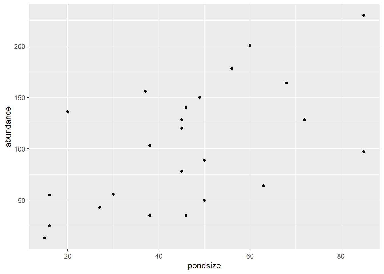
Thats our basic scatter plot. Simply using the geom_point() we covered breifly in the basic plots section.
From here, we can customise our points using a variety of arguments within geom_point().
Colour
Colouring our points can be done in two ways. We can use the colour commands within our aesthetics and colour by a factor in our dataset, or, we can colour all the points within geom_point(). Lets cover the aes() commands.
ggplot(tadpoles, aes(x=pondsize, y=abundance, colour=reeds, shape = reeds)) +
  geom_point()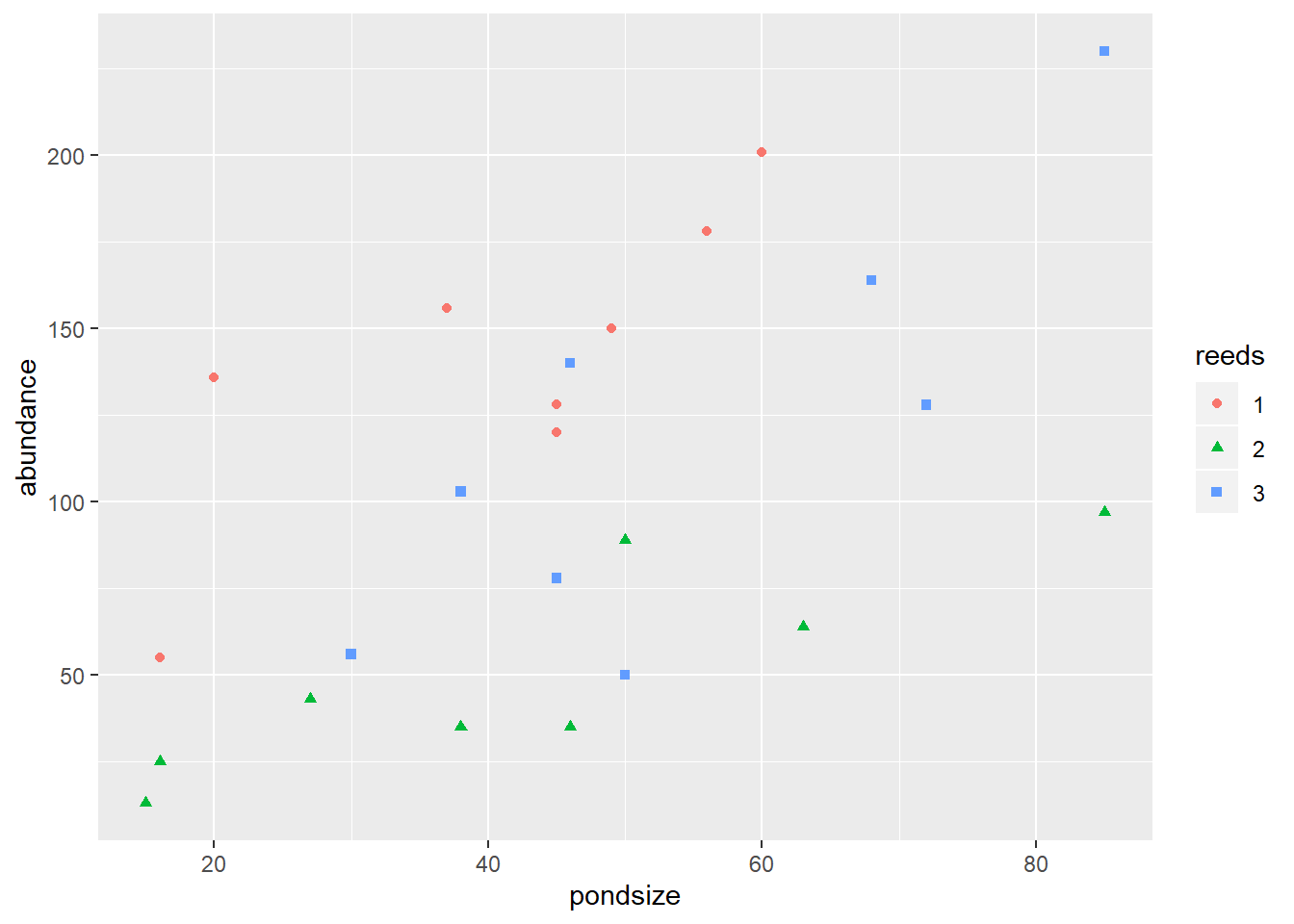
As we covered in the basic plotting section, changing the colour and shape of points can be done through the use of “colour” and “shape” arguments within the aesthetics of ggplot or any geometric object (e.g. geom_point). To change the colour of these manually simply use scale_colour_manual() or scale_shape_manual() like so:
ggplot(tadpoles, aes(x=pondsize, y=abundance, colour=reeds, shape = reeds)) +
geom_point()+
scale_colour_manual(values = c("mediumspringgreen", "forestgreen", "black"))+
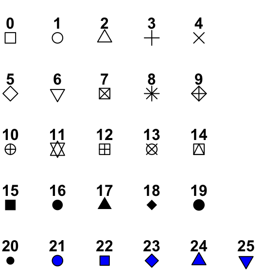
scale_shape_manual(values = c(15, 16, 17))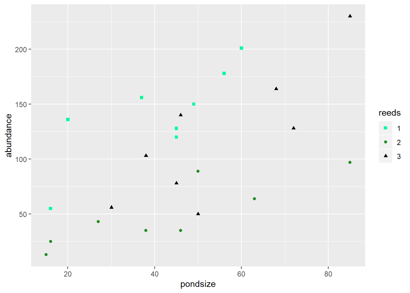
Each of the scale commands requires you to list the colours/shapes within a concatenated (c) list. This will be all most of you will ever need so simply copy those lines and replace/add values as you need.