Logistic regression
For this section, we will be using the nestpredation.csv data set
In our third dataset, we analysed the nest predation dataset using a generalised linear model with a binomial distribution, also known as a Logistic Regression.
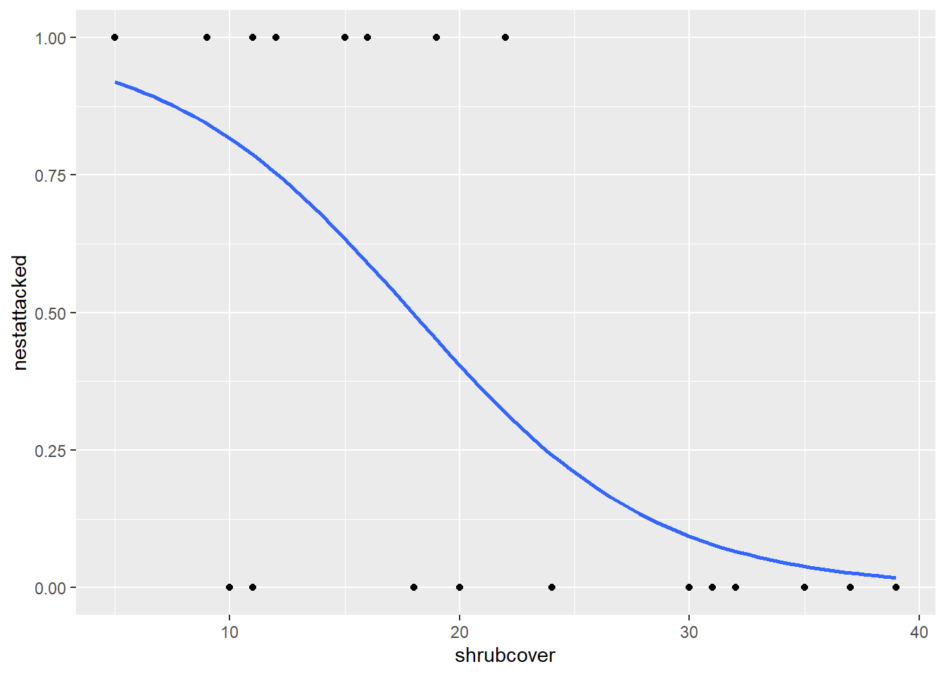
In this scenario, our data is measuring whether a nest was attacked or not in areas of different shrubcover. When we analyse this using a GLM, it is calculating the probability of a nest being attacked, given different values of shrubcover. As such, we need to plot this in a similar manner.
First let’s demonstrate what happens when we don’t take the binomial distribution into account.
ggplot(nest, aes(x=shrubcover, y=nestattacked)) +
  geom_point()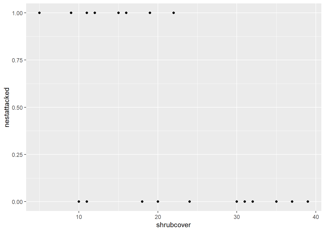
Notice how it has plotted the points at either 0 or 1 for each of the corresponding shrubcover values. This does not tell us anything about the likelihood of a nest being attacked given a value of shrubcover.
There are multiple methods for producing this plot. The one we will be using generates the relationship between our variables in the code itself.
ggplot(nest,aes(x=shrubcover, y=nestattacked)) +
  geom_smooth(method = glm, method.args= list(family="binomial"))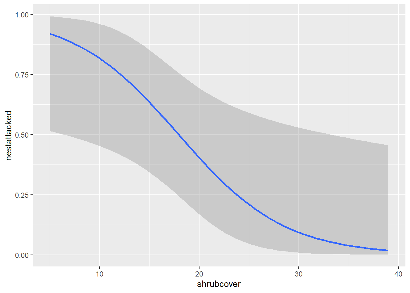
This method utilises the geom_smooth() function we were using for our linear model. This time we specify the glm relationship in the method argument, instead of lm. We also need to include a second argument called method.args which stands for method arguments, or, additional arguments for the method we have specified. We need to include this so we can inform our code that our distribution (family) is binomial. By including this, we produce our probability curve
As before, we can edit all of the things we did with the linear line because we are using the same command geom_smooth(). Like removing our errorbars.
ggplot(nest,aes(x=shrubcover, y=nestattacked)) +
  geom_point()+
  geom_smooth(method = glm, method.args= list(family="binomial"), se=FALSE)